Today we've introduced an entirely revamped user interface for the Losant platform. Over the last few years we've released a ton of additional functionality and we've paid very close attention to how users navigate and utilize Losant on a daily basis. This update incorporates what we've learned, and the feedback we've received from you, into a much more intuitive and well-organized user interface.
Vertical Navigation
The first thing you'll notice after logging in is that the main navigation has moved from the top of the screen to the left side. As we continued to grow the product, the previous horizontal navigation made it difficult to fit the available features and difficult to group and arrange the items in meaningful ways. The new navigation provides much more space to easily and quickly access your resources. We've also grouped the items in a more careful and deliberate way.
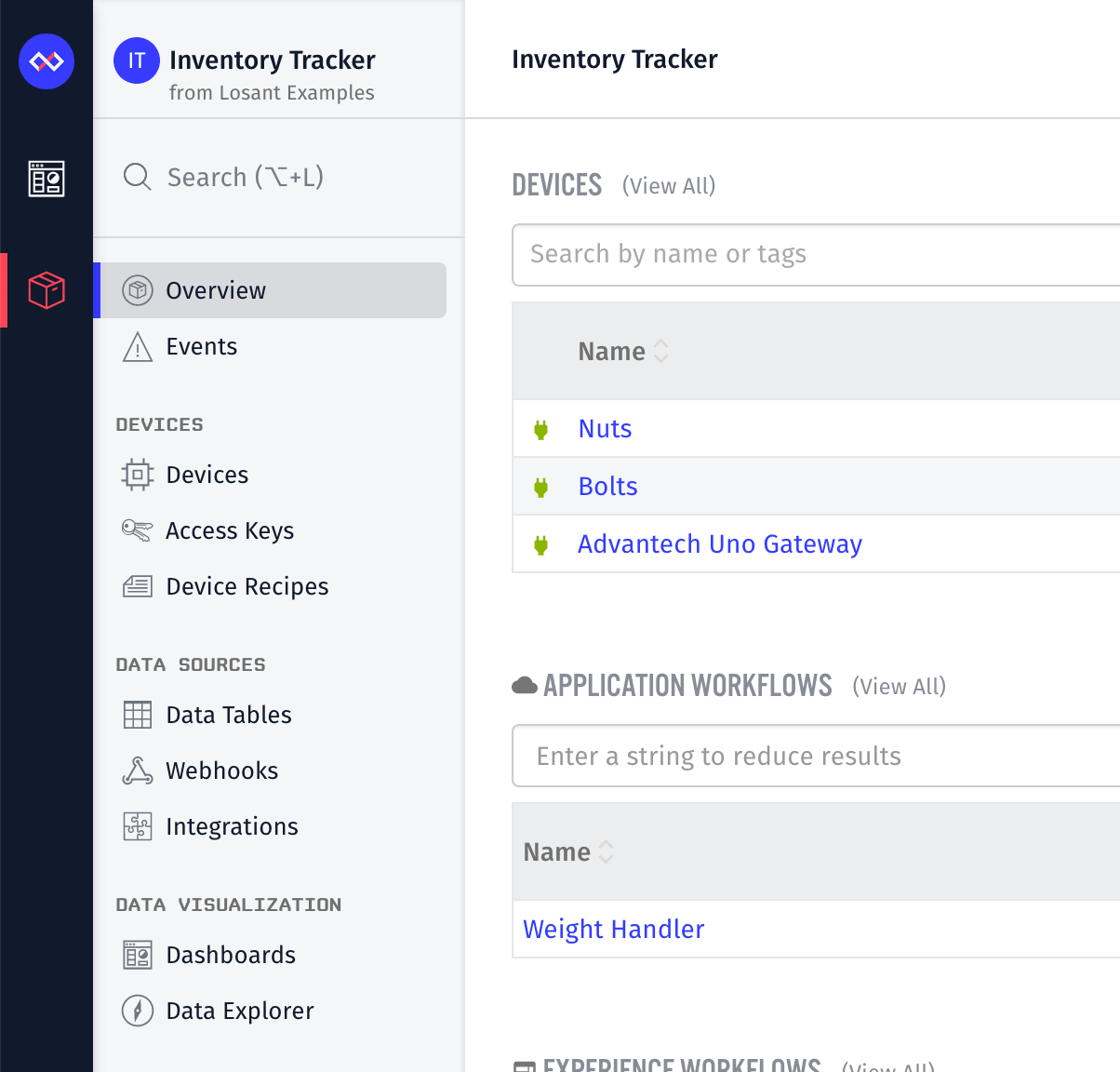
When we analyzed the most common browsers and screen resolutions used by you, we also found that there is typically much more available horizontal screen real estate than vertical. Moving the navigation to the side freed up some of this limited vertical space, giving you more room to work.
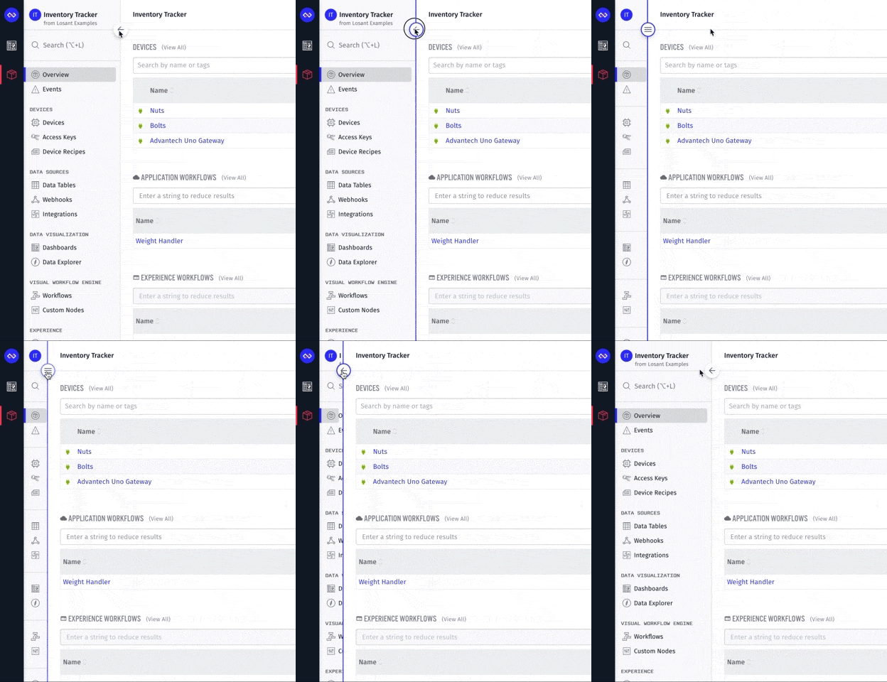
If you do need more space, especially when editing workflows, you can always collapse the menu.
Dashboards Are Now Owned by Applications
The most significant underlying change we've made is to the ownership model of dashboards. When we originally created the dashboard functionality, we thought it would be nice to support displaying device data from multiple different applications. This means that dashboards couldn't be owned by a single application, they had to be owned by the Organization (or Sandbox). As our customer base grew and more applications were developed, it quickly became apparent that most users thought of the dashboard as part of the application itself. In fact, of the thousands of dashboards currently running on Losant, 97 percent of them are only displaying data from a single application.
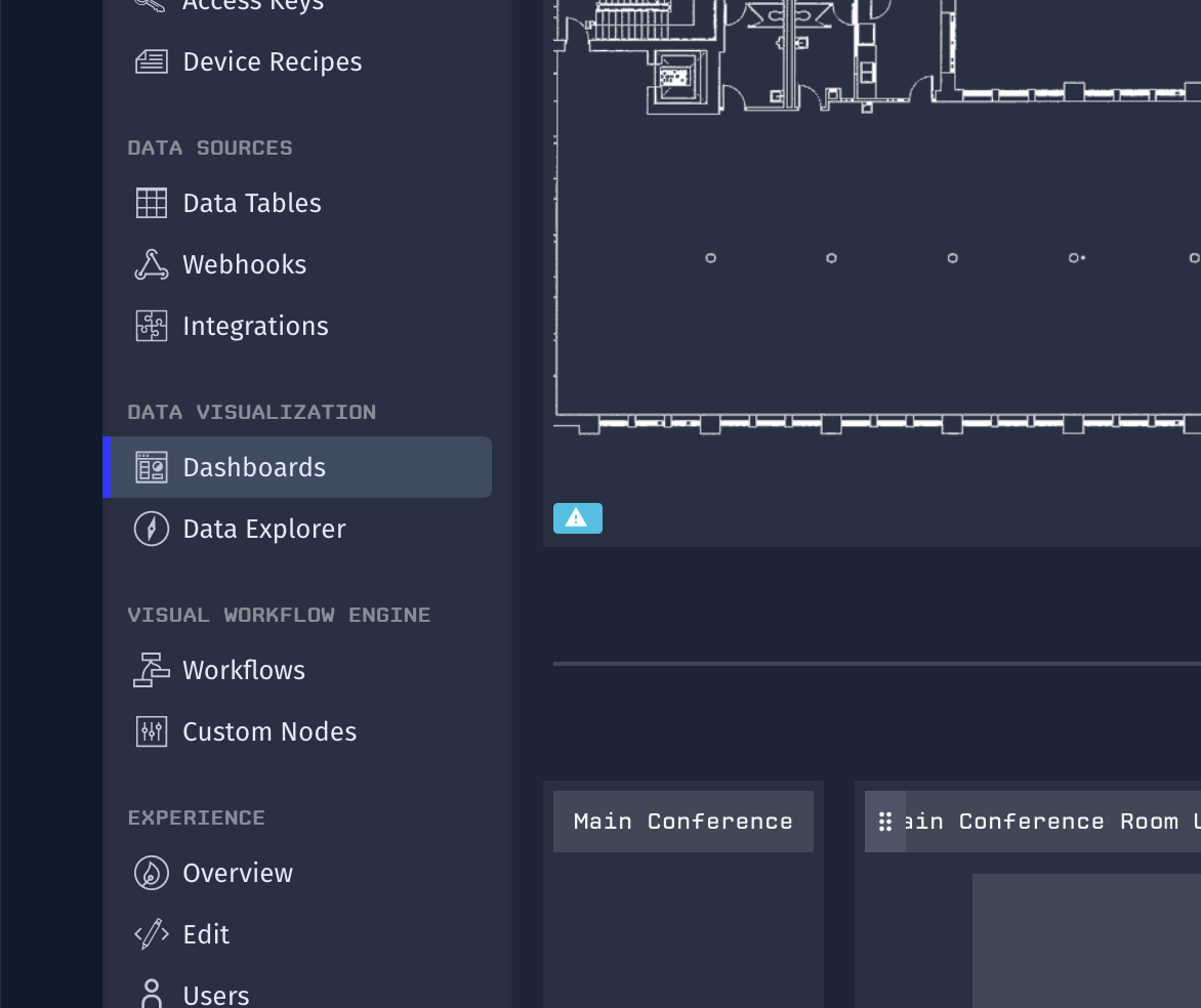
As part of this release, we have automatically migrated all dashboards that reference a single application into the application itself. This change makes the process of switching between your dashboards and other application resources, like devices and workflows, much more streamlined. You can now access all of your application's dashboards on the new "Dashboards" application menu.
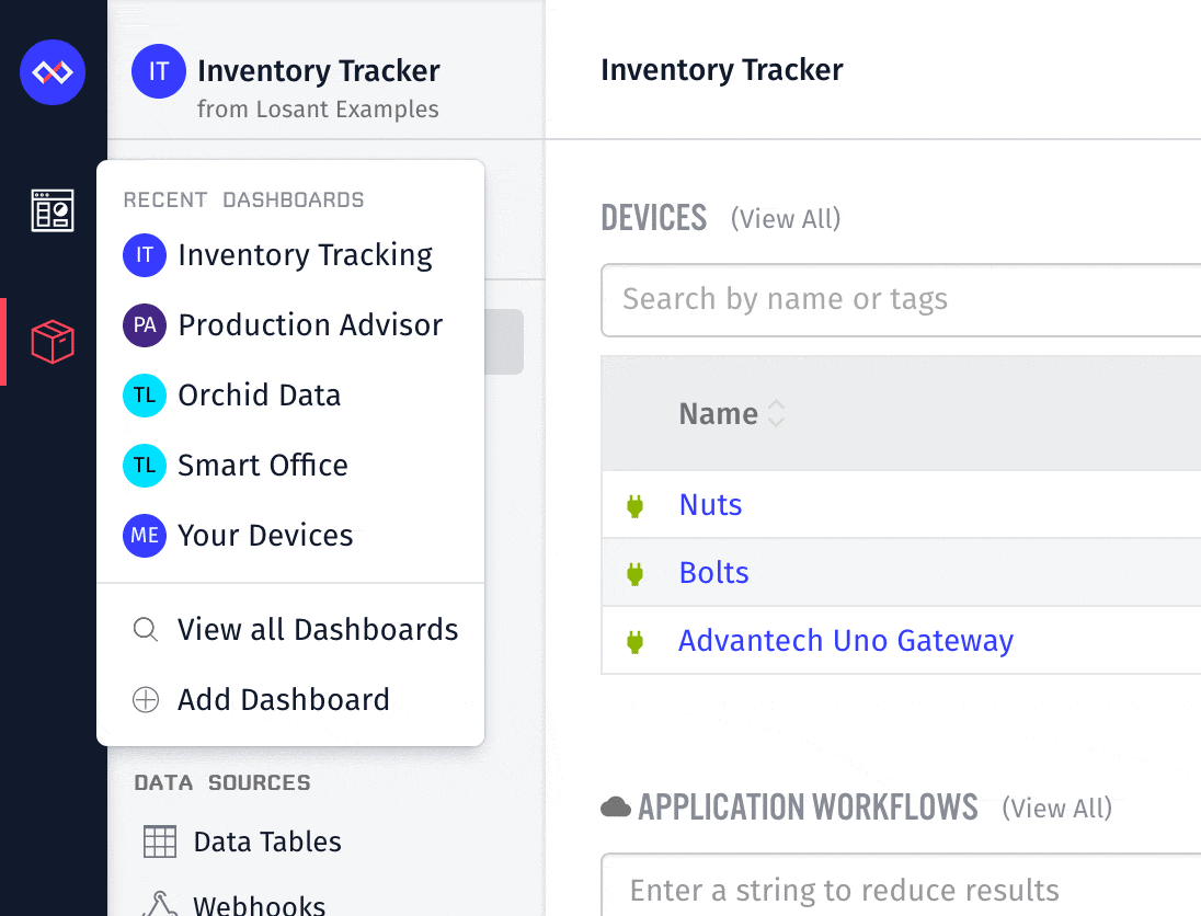
Any non-migrated dashboards (ones that reference data from multiple applications) can still be accessed in a similar way to what you're familiar with. The main navigation bar, which is now on the far left of the screen, still displays a list of recent dashboards and allows you to view all of your dashboards, regardless of whether or not they are now owned by an application.
Application-Wide Search
Making it more efficient to quickly navigate your application was a major motivator for this update. With that goal in mind, we've also introduced the ability to search your entire application to quickly find and navigate between your resources. You can access this by clicking the search box at the top of the application menu or by using the Option-L (Mac) or Alt-L (Windows) hotkey.
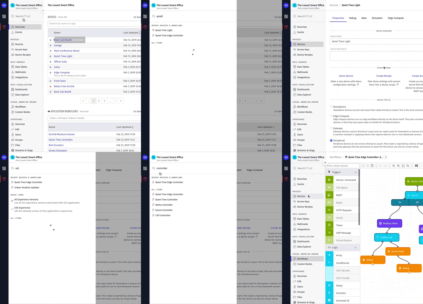
When you first open the menu, you'll see your most recently viewed devices and workflows. This provides a quick way to switch between resources you're actively developing. You'll also see shortcuts to common tasks like adding a device or creating a new workflow. Once you start typing, you'll see a list of resources that match your input text. For larger applications with thousands of devices and hundreds of workflows, this new search feature can be an invaluable tool.
Updated Organization Permissions Interface
With dashboards now being part of an application, we also re-thought the organization permissions user interface. The new design makes it much easier to view and understand how permissions are inherited and overridden on a per-application and per-dashboard basis.
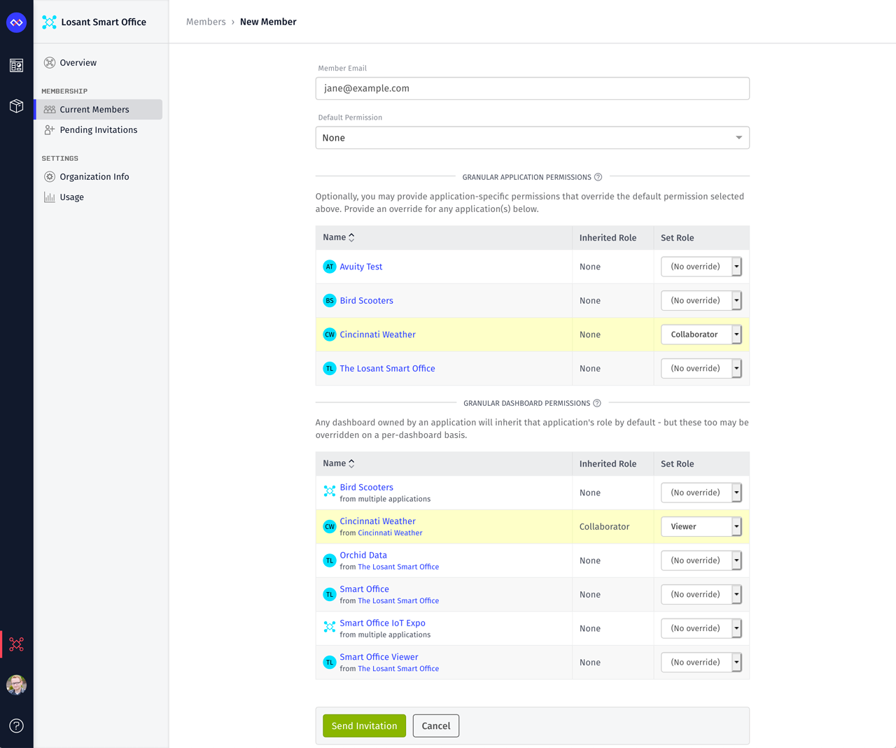
Prior to this update, whenever you invited a member to your organization, the "Default Permission" you gave them was inherited by all applications and dashboards owned by that organization. You could then override that default for each individual application and dashboard.
Since dashboards are now owned by applications, those dashboards will now automatically inherit the permissions applied to the application, which can also be overridden if needed. This change makes it much easier to manage permissions between applications and dashboards for large teams and large applications. If you grant collaborator access to a specific application, that user will receive collaborator access to all dashboards created under that application without you having to explicitly grant access to each and every one.
The screenshot above is showing an example of this inheritance model. The "Default Permission" is set to "None", which means this user will have access to no applications and no dashboards unless we specifically grant it. I then granted them "Collaborator" access to the "Cincinnati Weather" application. Since the "Cincinnati Weather" dashboard is owned by that application, you can see its inherited role is automatically set to "Collaborator". For this example, I don't want the user to be able to change that dashboard, so I can override it to "Viewer".
Our automatic migration of dashboards into applications retains the previous permissions that you applied, so no action is required on your part.
Looking Towards the Future
A lot of the capability we release and changes we make are stepping stones to much larger initiatives. Moving dashboards into applications is a perfect example of this. While the migration does offer a lot of benefits, which are outlined above, this move is part of a larger goal. Throughout this year, we'll be making many application resources much more portable. This means you'll be able to export many types of resources as reusable templates. This will eventually culminate in the portability of an entire application. You'll be able to import an existing application, which includes all of the underlying resources, to quickly bootstrap new projects. Since dashboards are so closely tied to applications in practice, this move was required in order to bundle it with the application for that long-term vision.
What's Next?
With every new release, we really listen to your feedback. By combining your suggestions with our roadmap, we can continue to make the platform easy for you. Let us know what you think in the Losant Forums.
